
The background
The brief
The complementary skillsets of the two firms would provide potential investors with a truly global investment platform and the innovative opportunity to build a balanced investment portfolio via a single firm.
As two different management teams were coming together for the first time, we were tasked with facilitating the development of a Brand Foundation – helping to build consensus about the core tenets of the new brand.
Once we had agreed what the new identity was going to represent, our job was to design a new visual identity that respected the heritage of both firms yet celebrated their union in an appropriate and contemporary manner.
What we did
Brand Foundation development
Logo design
Visual identity design
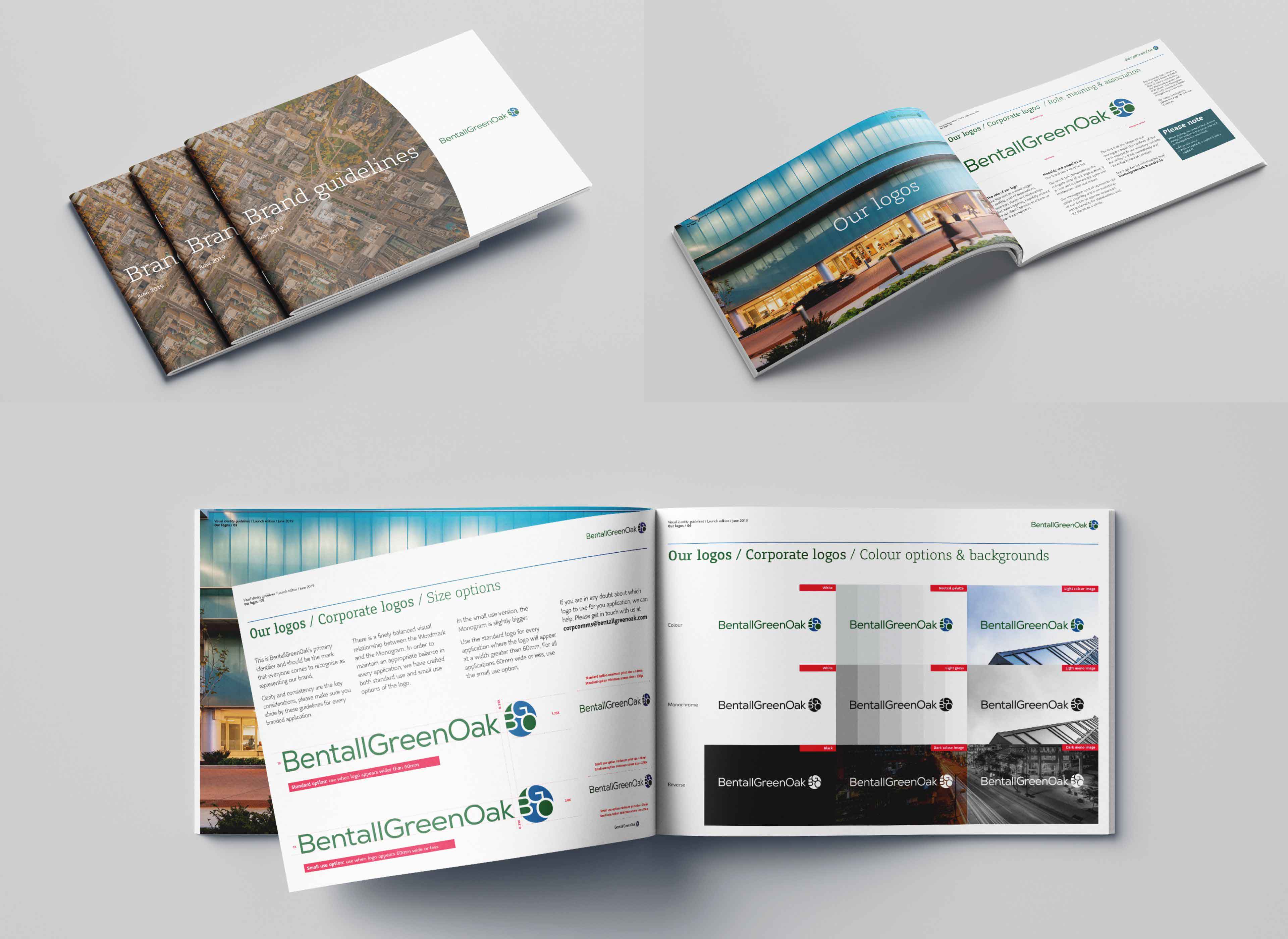
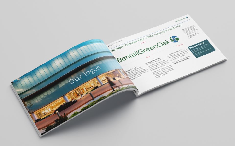
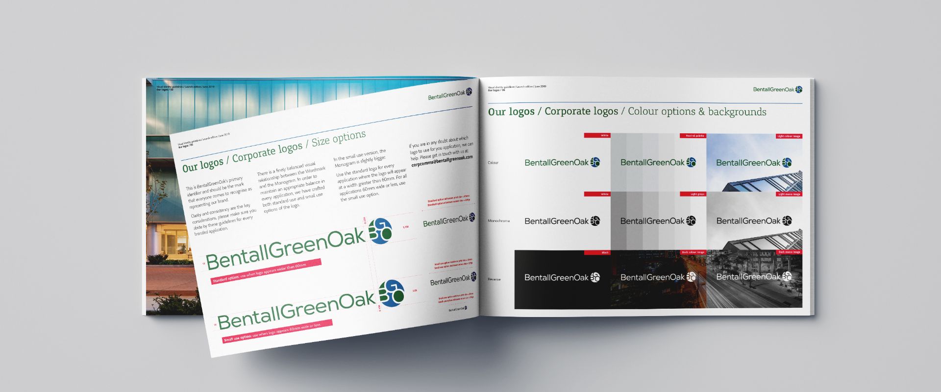
Guidelines
Asset production
The background
GreenOak was a highly successful ‘Value-Add’ property investment firm, maximising the asset value of developments in Europe and Asia – then capturing the resulting appreciation for distribution as returns to investors.
Bentall Kennedy was a huge ‘Core’ property investment and management firm, focussed on the USA and Canada. They specialised in infrastructure projects, such as warehousing or student accommodation, that would lead to predictable, long-term returns from rental income.
As part of the global Sun Life family, these two, very different, private equity companies were set to merge, creating BentallGreenOak, a company servicing over 750 clients through 24 offices in 12 countries – with nearly $50 billion of assets under management.
The brief
The complementary skillsets of the two firms would provide potential investors with a truly global investment platform and the innovative opportunity to build a balanced investment portfolio via a single firm.
As two different management teams were coming together for the first time, we were tasked with facilitating the development of a Brand Foundation – helping to build consensus about the core tenets of the new brand.
Once we had agreed what the new identity was going to represent, our job was to design a new visual identity that respected the heritage of both firms yet celebrated their union in an appropriate and contemporary manner.
What we did
Brand Foundation development
Logo design
Visual identity design
Guidelines
Asset production
Starting wide
We were brought in early in the program, so no questions about the new brand name, ‘One word or two?’ or ‘Which letters are capitalised?’ had been asked or answered. There was also no consensus about the style or content of the new logo. Wordmark, wordmark and symbol, monogram – which was the right way forward? Which legacy colours should we include? With potentially opposing preferences to mitigate, we had to explore widely.
Establishing a robust foundation
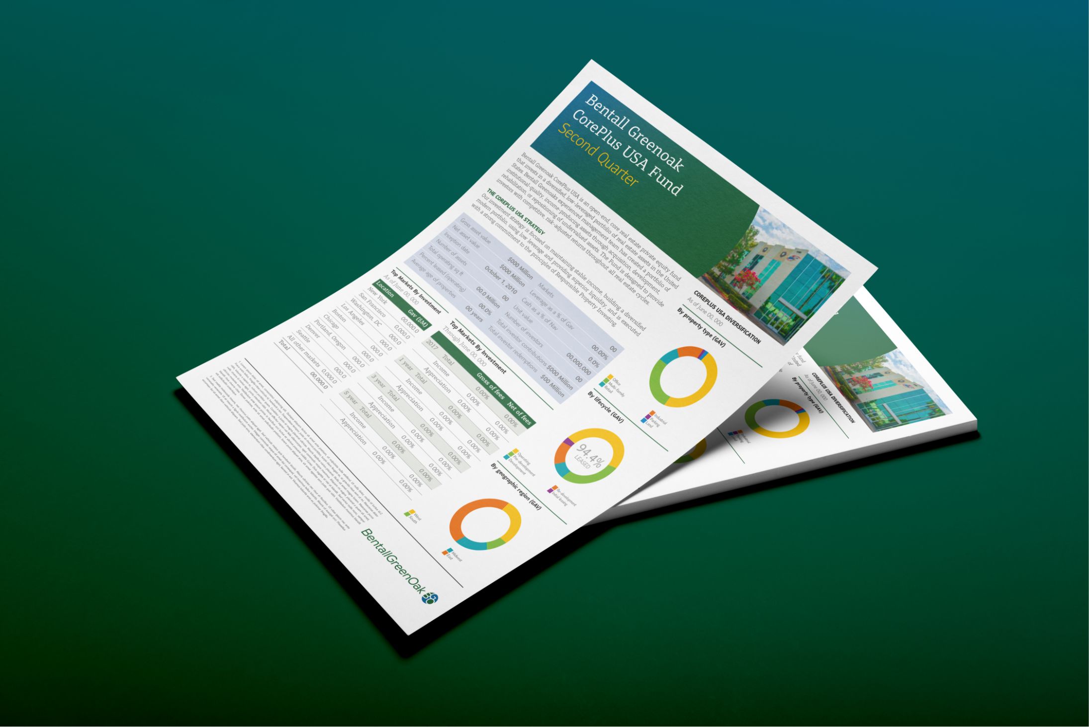
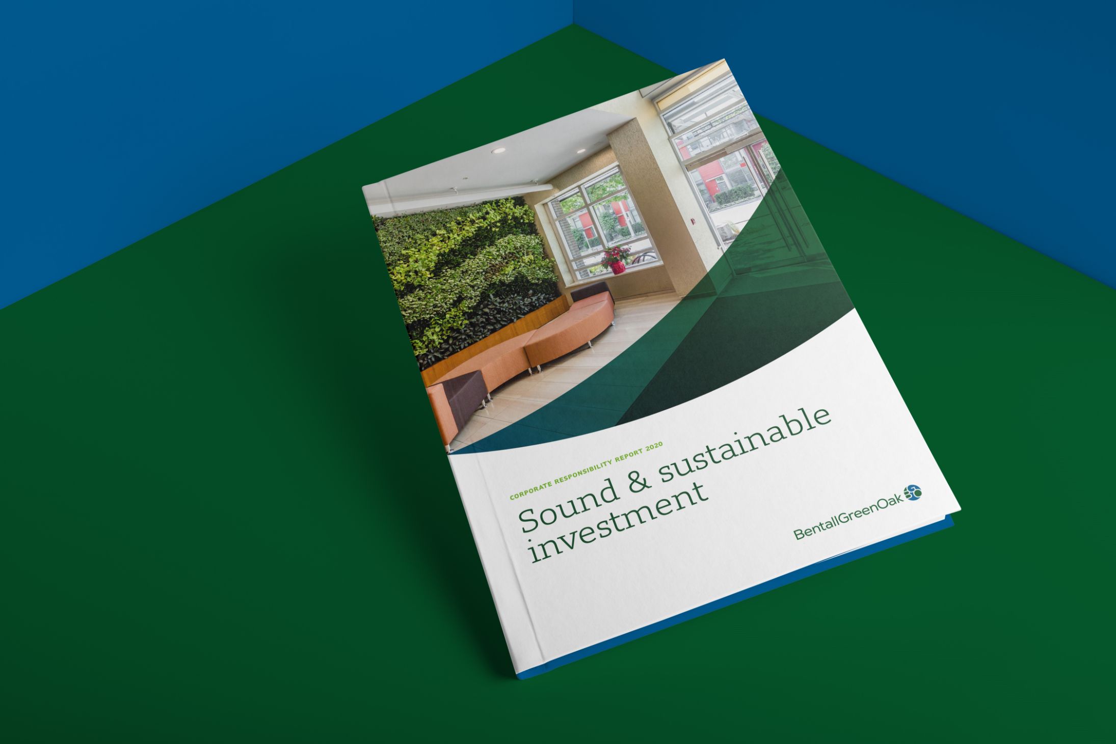
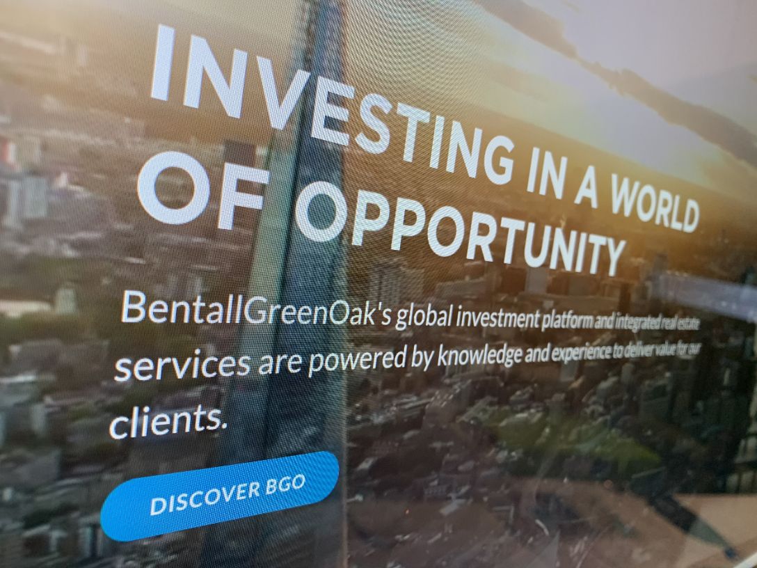
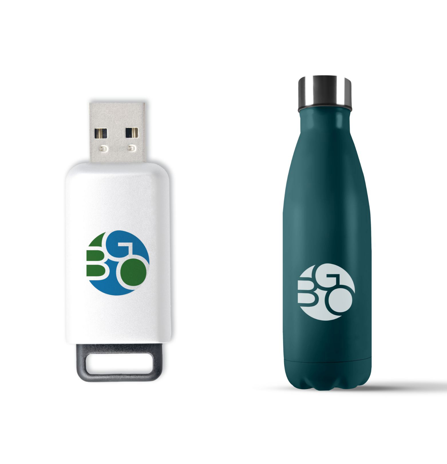
The approved solution was inspired by the newly articulated brand essence, ‘Investing in a World of Opportunity’. The BGO monogram infers a global scope and facilitates the combination of Bentall Kennedy blue and GreenOak green. In the monogram, the letters are all connected, signifying the unification of the two companies.
Establishing a robust foundation
The approved solution was inspired by the newly articulated brand essence, ‘Investing in a World of Opportunity’. The BGO monogram infers a global scope and facilitates the combination of Bentall Kennedy blue and GreenOak green. In the monogram, the letters are all connected, signifying the unification of the two companies.
The long and short of it
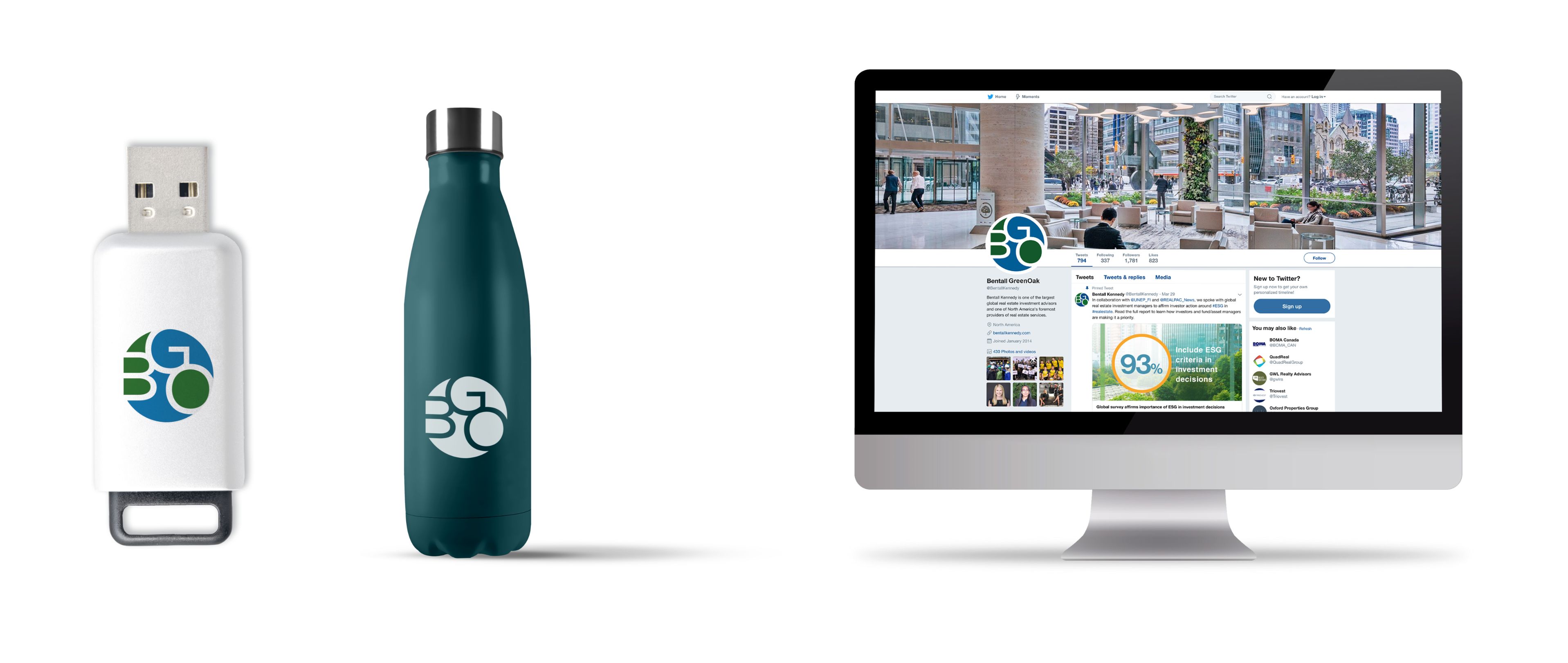
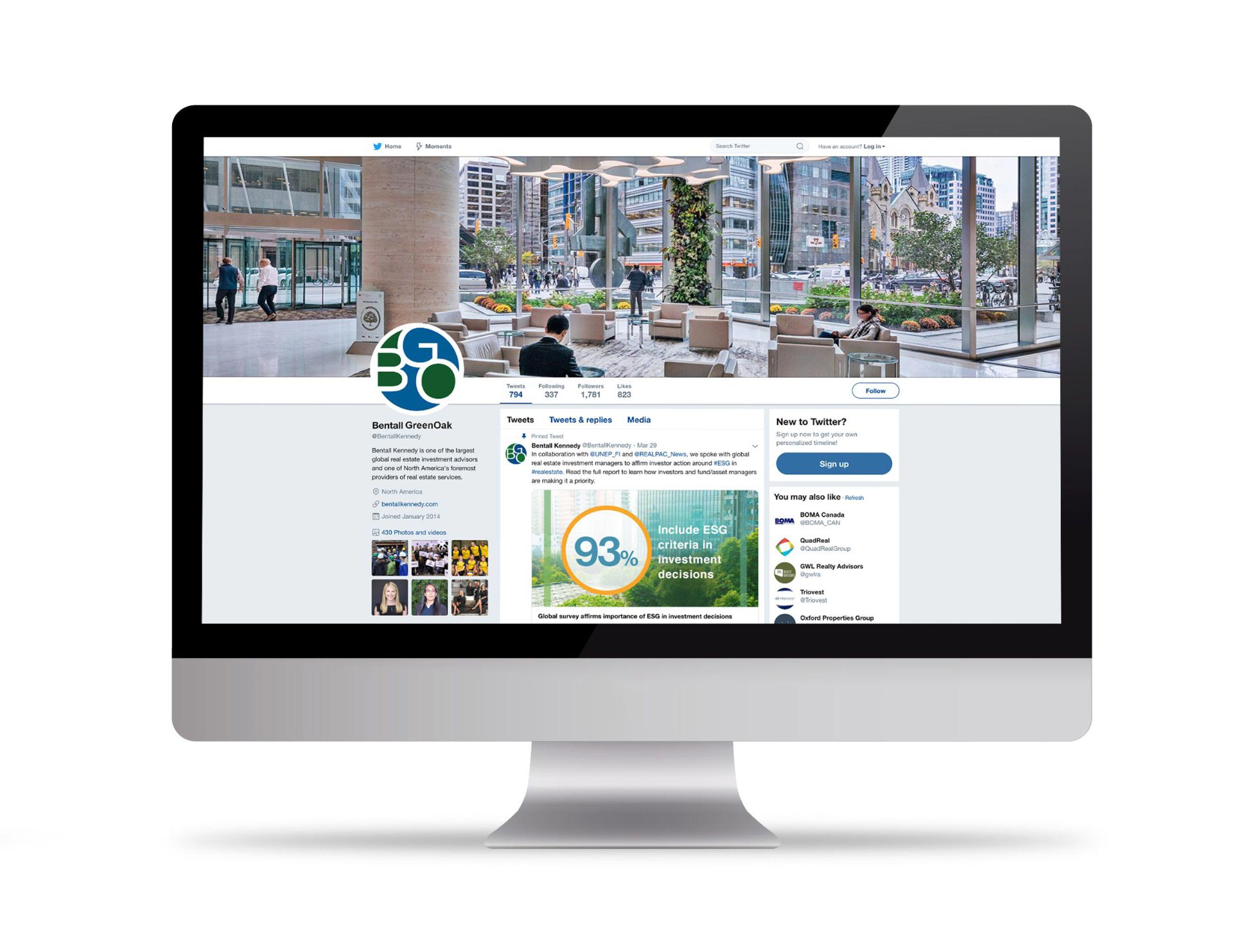
There is no mistaking that BentallGreenOak is a long word. This makes it difficult to apply effectively when width is constricted, such as social media avatars. As the vernacular, ‘BGO’ was already widespread amongst the staff and actively encouraged by the leadership team, we included use of the monogram, without the wordmark, into the guidelines.
The long and short of it
There is no mistaking that BentallGreenOak is a long word. This makes it difficult to apply effectively when width is constricted, such as social media avatars. As the vernacular, ‘BGO’ was already widespread amongst the staff and actively encouraged by the leadership team, we included use of the monogram, without the wordmark, into the guidelines.


A suite of logos
The logo also had to act as part of a system that could adopt an existing prefix and suffix so that, ‘Proudly managed by BentallGreenOak’ and ‘BentalGreenOak Residential Services’ could be on brand from the outset.
A suite of logos
The logo also had to act as part of a system that could adopt an existing prefix and suffix so that, ‘Proudly managed by BentallGreenOak’ and ‘BentalGreenOak Residential Services’ could be on brand from the outset.