The background
The brief
The imminent opening of a new UK headquarters and new satellite offices in other major markets, along with the development of new service offers had led Aposave’s leadership team to conclude that their existing logo and visual identity no longer effectively represented their brand. The organisation had ‘grown up’ and a new identity needed to reflect this.
Another issue was that Aposave’s relationship with Abacus Medicine, was ill-defined. This lack of definition was undermining a key element of Aposave’s competitive position – that its clients could depend on the far-reaching and long-established logistical network of its parent company.
Our task was to create a contemporary new logo and visual identity that afforded the Aposave brand an appropriate level of independent gravitas and stature while clearly displaying its Abacus Medicine DNA.
What we did
-
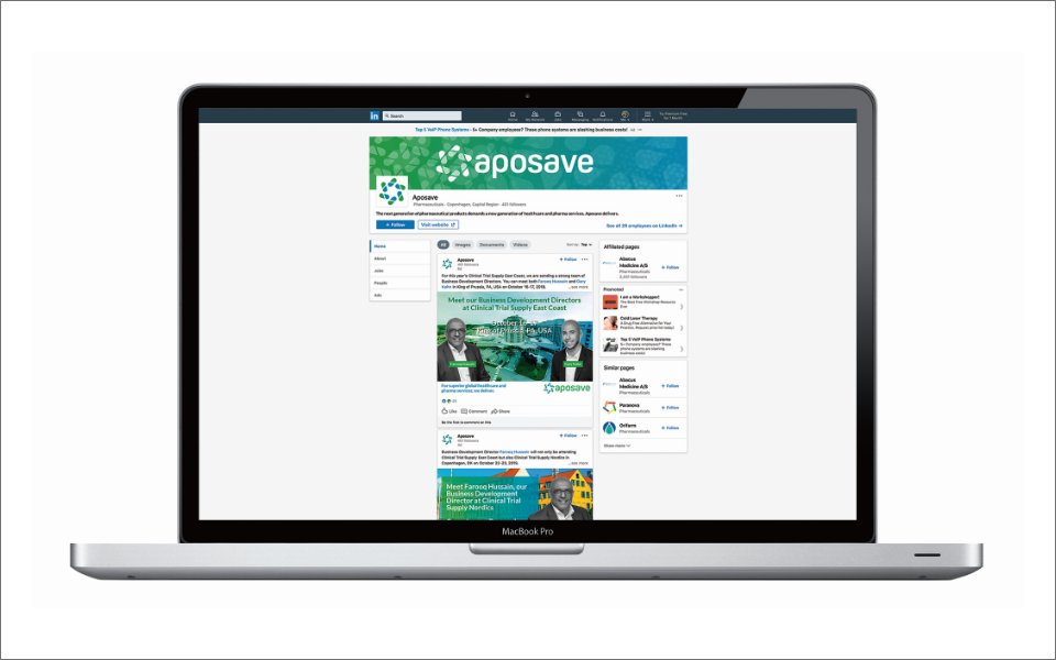
Logo design
-
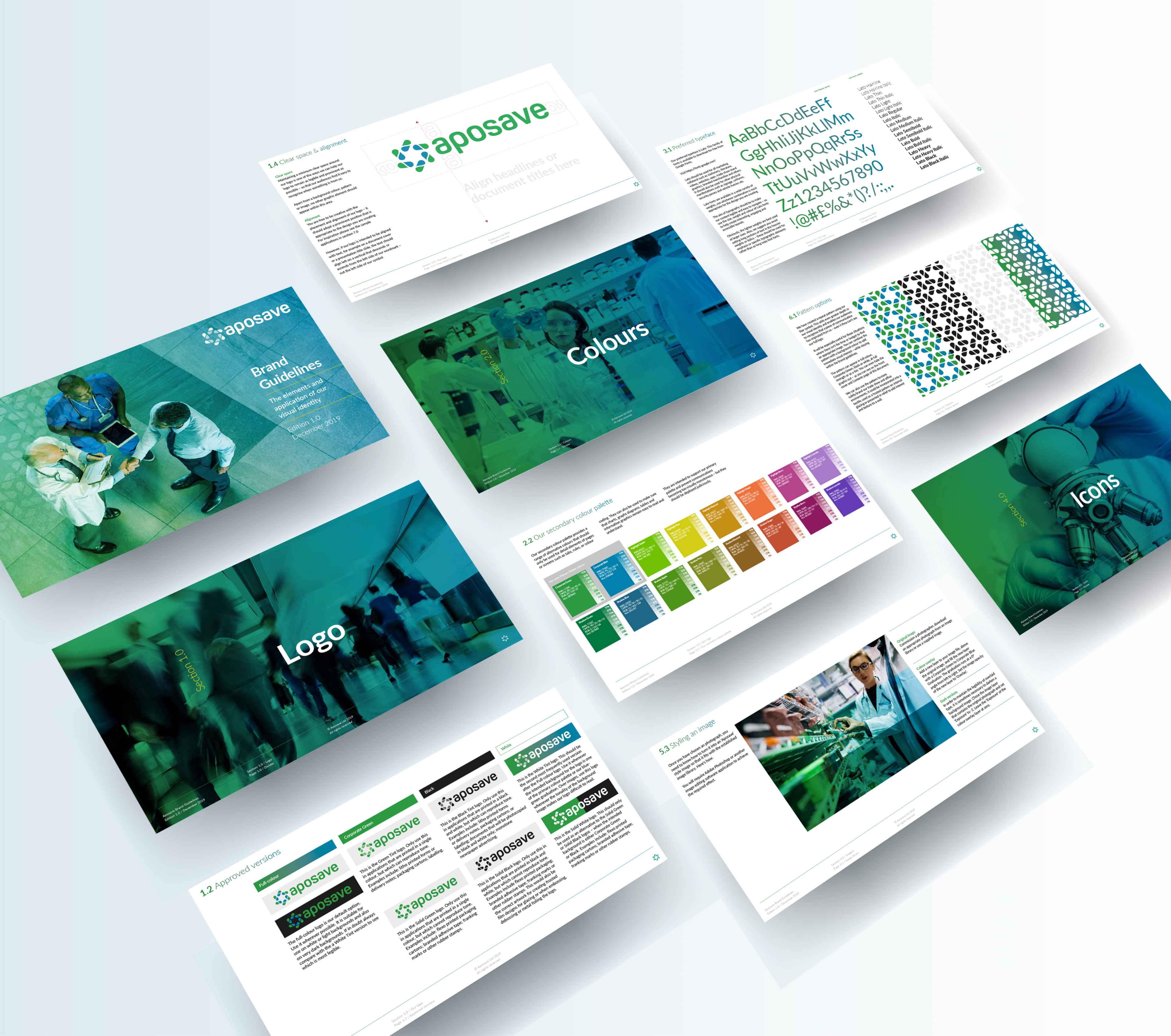
Visual identity development
-
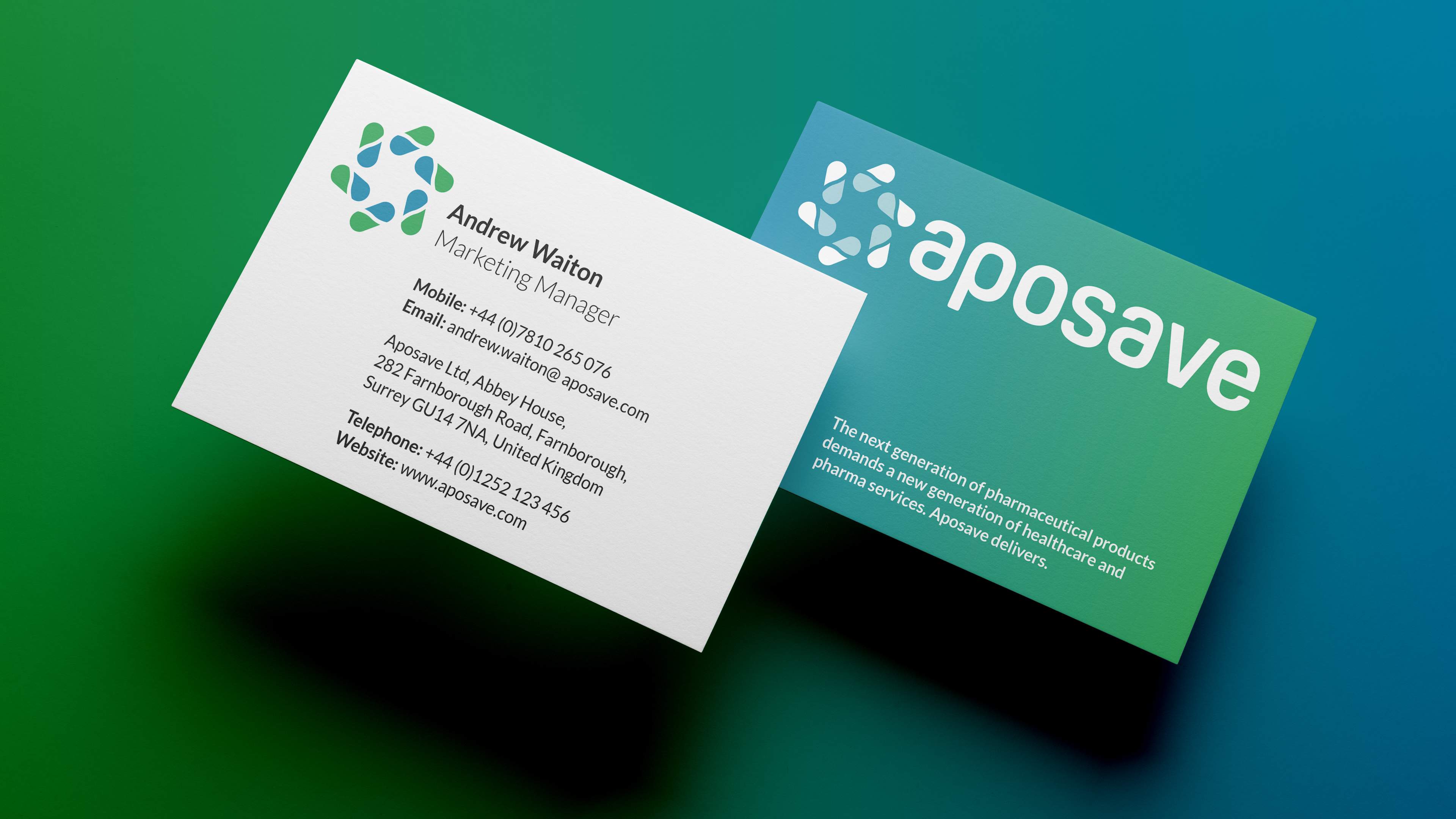
Sample applications
-
Guidelines
-
Asset production
The background
Aposave is the pharmaceutical services arm of the Abacus Medicine Group – a medical logistics organisation with one of the strongest supply networks in Europe.
Aposave provides a selection of specialist, bespoke services that fall outside of the remit of large scale logistics such as sourcing hard to find medicines for individual patients, or making sure participants in successful clinical trials can continue to receive treatment after the trial has ended.
The brief
The imminent opening of a new UK headquarters and new satellite offices in other major markets, along with the development of new service offers had led Aposave’s leadership team to conclude that their existing logo and visual identity no longer effectively represented their brand. The organisation had ‘grown up’ and a new identity needed to reflect this.
Another issue was that Aposave’s relationship with Abacus Medicine, was ill-defined. This lack of definition was undermining a key element of Aposave’s competitive position – that its clients could depend on the far-reaching and long-established logistical network of its parent company.
Our task was to create a contemporary new logo and visual identity that afforded the Aposave brand an appropriate level of independent gravitas and stature while clearly displaying its Abacus Medicine DNA.
What we did
-
Logo design
-
Visual identity development
-
Sample applications
-
Guidelines
-
Asset production
Indifference obliterated
“Just to follow up our call and say another thank you. It’s been very easy to work with you and I am delighted with the end product which has transformed the visual identity of Aposave.”
Andrew Waiton
Marketing Manager
Indifference obliterated
“Just to follow up our call and say another thank you. It’s been very easy to work with you and I am delighted with the end product which has transformed the visual identity of Aposave.”
Andrew Waiton
Marketing Manager
Part of the family, not a clone
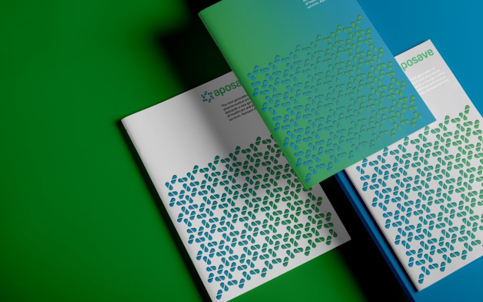
We took on board the Abacus Medicine symbol, their typefaces and their corporate blue – but then explored the spectrum of similarity and difference until we found a place that was uniquely Aposave – but undeniably part of the Abacus Medicine family.
Part of the family, not a clone
We took on board the Abacus Medicine symbol, their typefaces and their corporate blue – but then explored the spectrum of similarity and difference until we found a place that was uniquely Aposave – but undeniably part of the Abacus Medicine family.
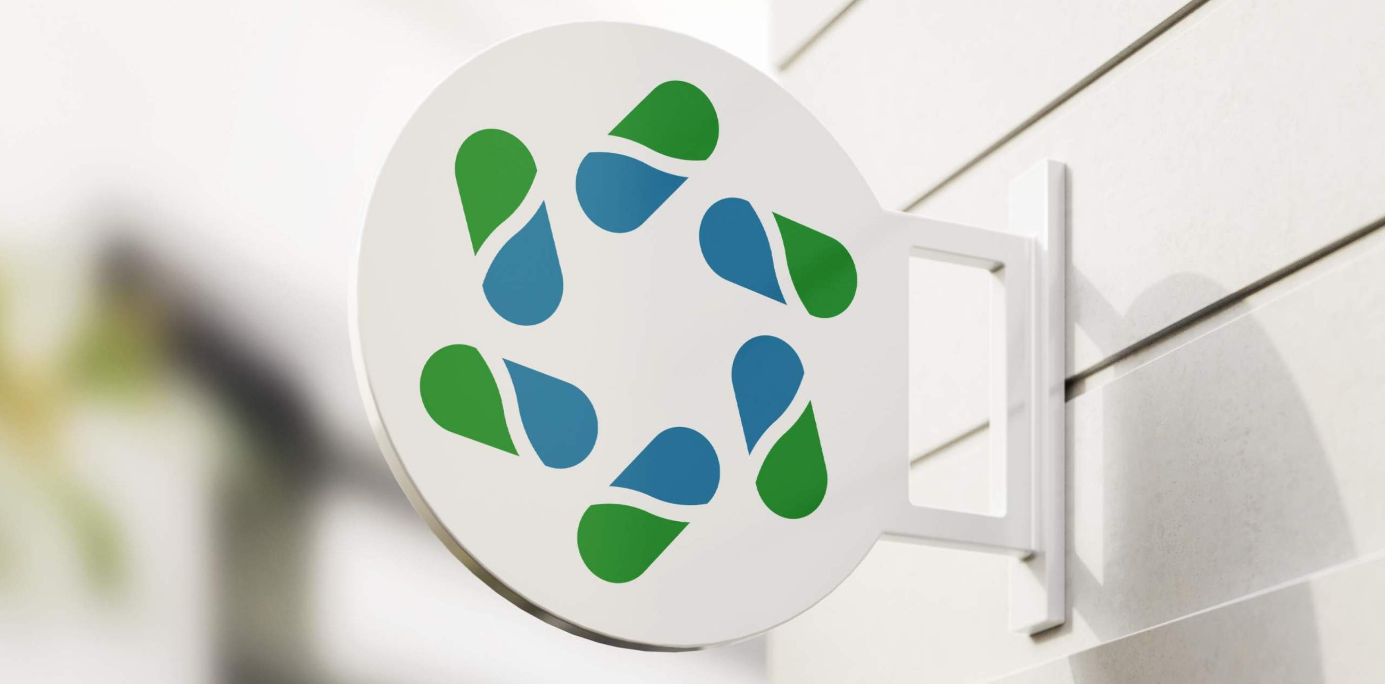
A unique fingerprint
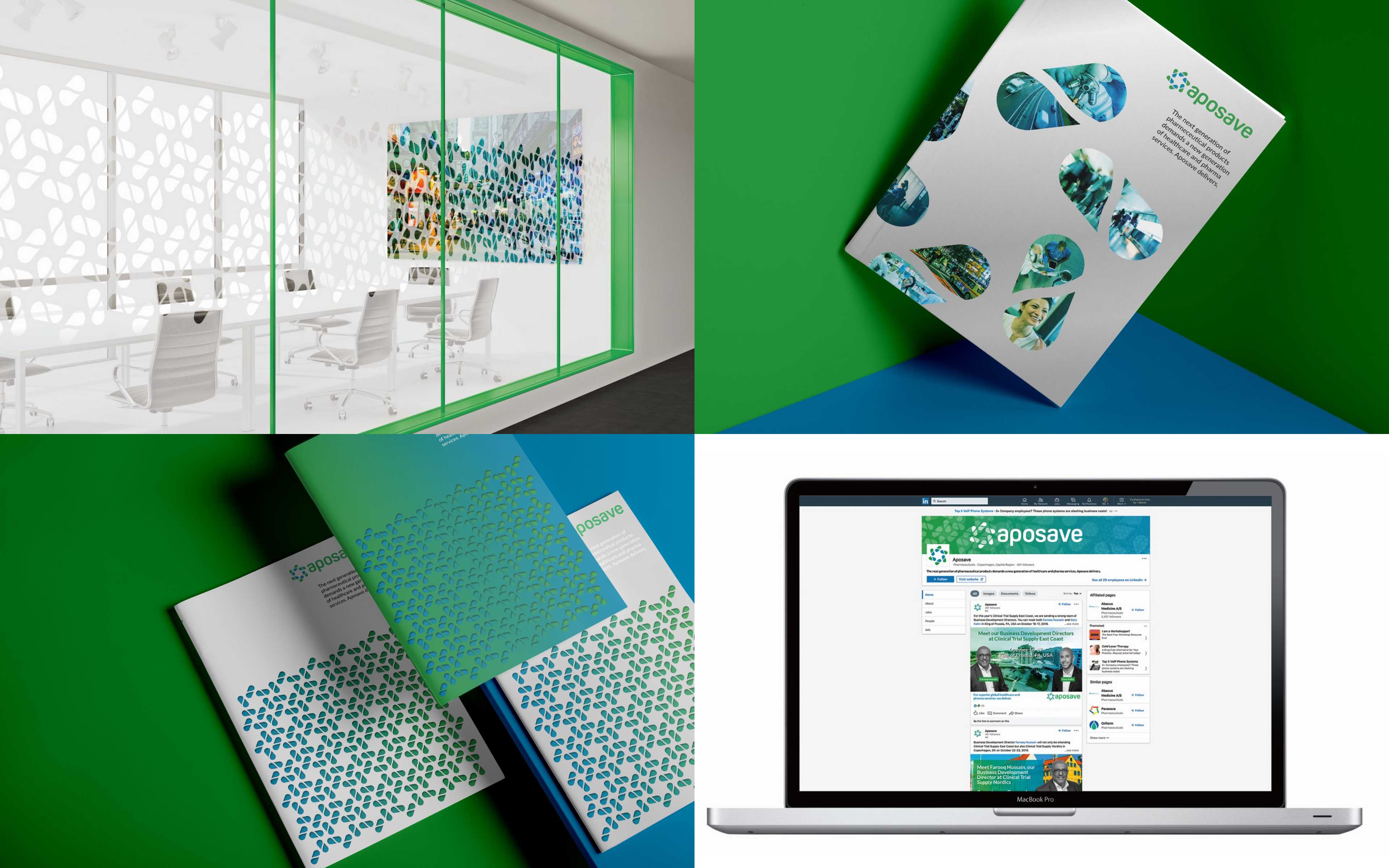
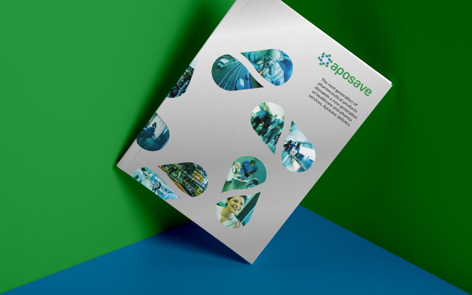
Taking the Aposave star symbol as the core element, we created repeat patterns, textured layered backgrounds and even an imagery window – providing plenty of scope for on-brand variety within the visual identity.
A unique fingerprint
Taking the Aposave star symbol as the core element, we created repeat patterns, textured layered backgrounds and even an imagery window – providing plenty of scope for on-brand variety within the visual identity.
Consistently iconic
We developed a bespoke icon style, based on a 60-pixel grid, creating an initial selection of glyphs and defining the design guidelines so that any competent designer could extend the suite when necessary.
Consistently iconic
We developed a bespoke icon style, based on a 60-pixel grid, creating an initial selection of glyphs and defining the design guidelines so that any competent designer could extend the suite when necessary.


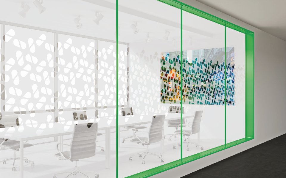
Picture perfect
Budgets and timescales often mean that imagery needs to be sourced from different places. To make sure they could be curated into a coherent and consistent visual resource, we developed a graduated colour overlay that could be applied to any image in post-production. We also identified the characteristics that define an ‘Aposave’ image so that anyone could select new imagery using common criteria.