Before | After
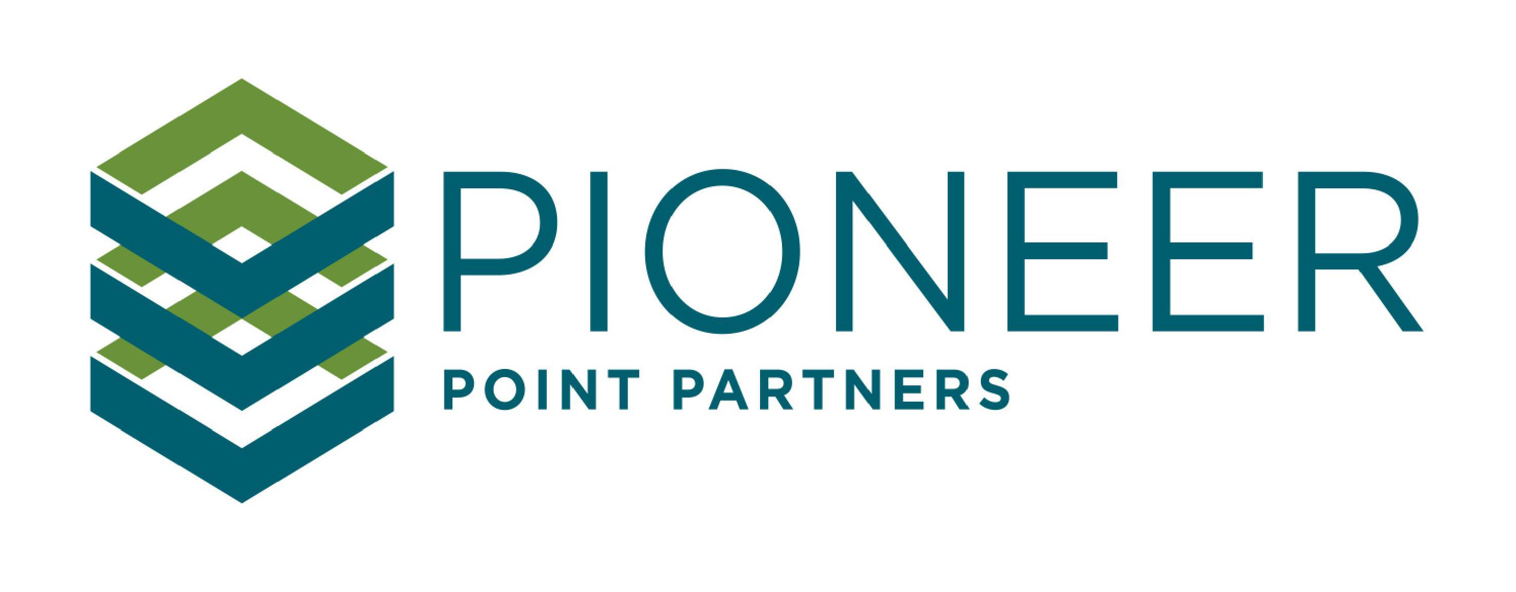


Before | After
The background
Founded by four partners in 2008, Pioneer Point Partners are an experienced infrastructure investment firm focussing on the energy transition and environment sectors, such as solar, biogas, energy from waste and plastic recycling, throughout Western Europe.
With more than 90 years of collective experience and over €800m invested, their sector knowledge is unrivalled. The founders were planning to launch their first multi-investment fund and recognised the need to present a contemporary and professional face to an audience of discerning institutional investors.
The brief
Pioneer Point’s existing logo and website was looking tired and out of date. It was undermining their name and position as foresighted experts with a track record of early investment in significant opportunity areas. Our brief was simple: to give their logo, visual identity and website a contemporary makeover – making sure that the result communicated the corporate gravitas necessary to engage institutional clients while amplifying their competitive advantage of deep sector knowledge and commitment to sustainability.
What we did
Interviews with the leadership team
Competitor audit
Positioning and tagline
Logo design
Visual identity development
Information architecture and UX design
Art direction and image selection
Responsive web page UI design
The background
Founded by four partners in 2008, Pioneer Point Partners are an experienced infrastructure investment firm focussing on the energy transition and environment sectors, such as solar, biogas, energy from waste and plastic recycling, throughout Western Europe.
With more than 90 years of collective experience and over €800m invested, their sector knowledge is unrivalled. The founders were planning to launch their first multi-investment fund and recognised the need to present a contemporary and professional face to an audience of discerning institutional investors.

The brief
Pioneer Point’s existing logo and website was looking tired and out of date. It was undermining their name and position as foresighted experts with a track record of early investment in significant opportunity areas. Our brief was simple: to give their logo, visual identity and website a contemporary makeover – making sure that the result communicated the corporate gravitas necessary to engage institutional clients while amplifying their competitive advantage of deep sector knowledge and commitment to sustainability.
What we did
Interviews with the leadership team
Competitor audit
Positioning and tagline
Logo design
Visual identity development
Information architecture and UX design
Art direction and image selection
Responsive web page UI design

Indifference obliterated
“Thanks for the hard work and patience on the rebrand and website, we really appreciate it and everyone is happy!”
Rupert Shaw – Managing Partner and Co-Founder
Pioneer Point Partners
Indifference obliterated
“Thanks for the hard work and patience on the rebrand and website, we really appreciate it and everyone is happy!”
Rupert Shaw – Managing Partner and Co-Founder
Pioneer Point Partners
Indifference obliterated
“Thanks for the hard work and patience on the rebrand and website, we really appreciate it and everyone is happy!”
Rupert Shaw – Marketing Manager
Pioneer Point Partners
Building consensus
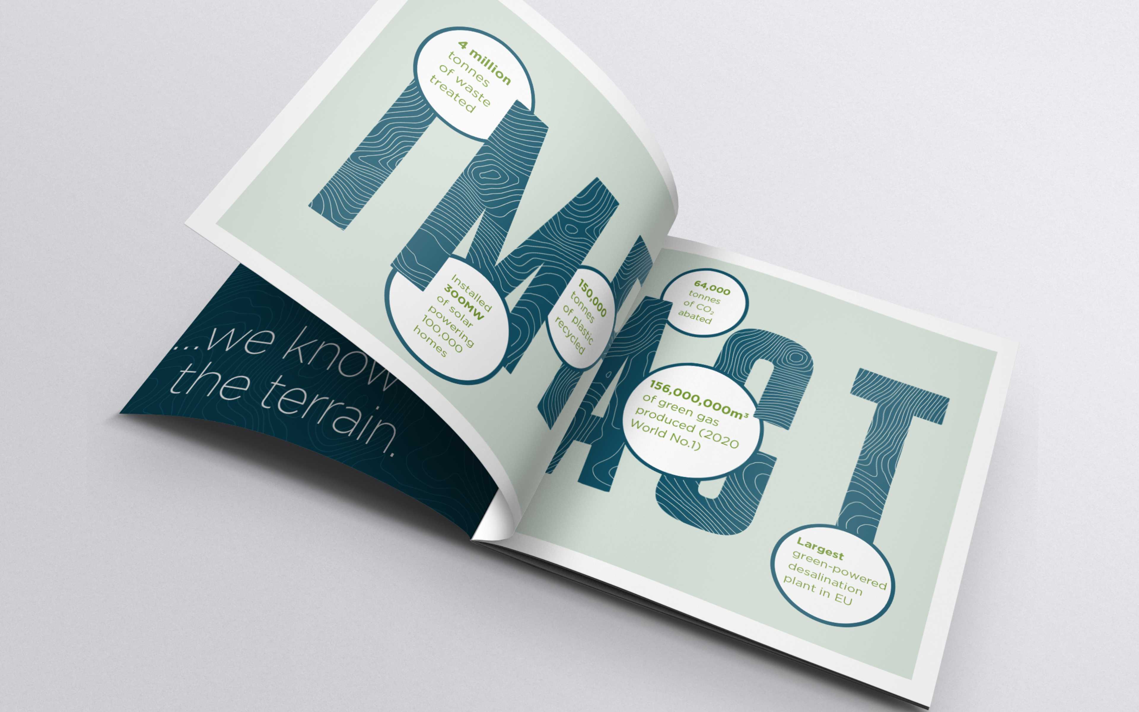
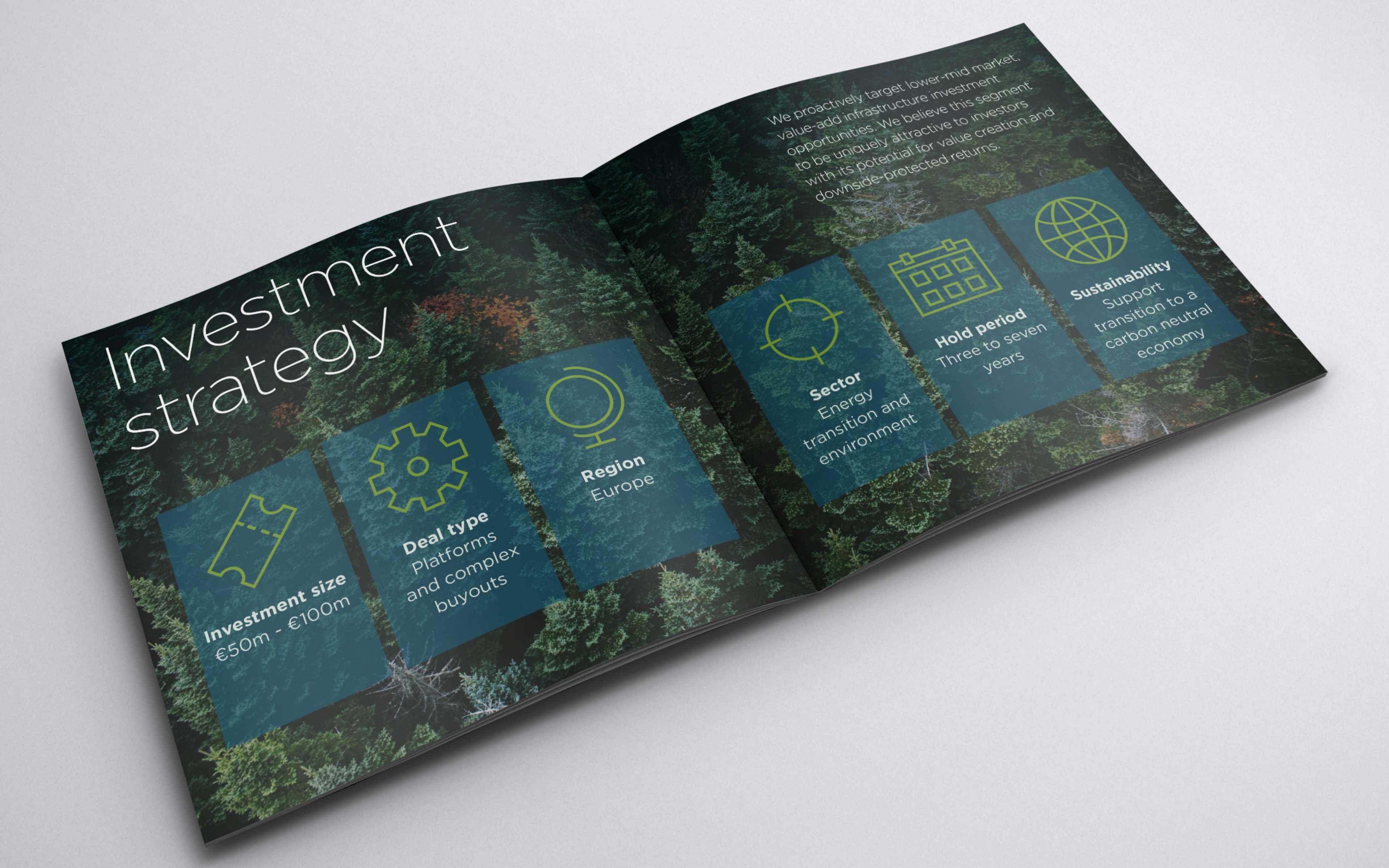
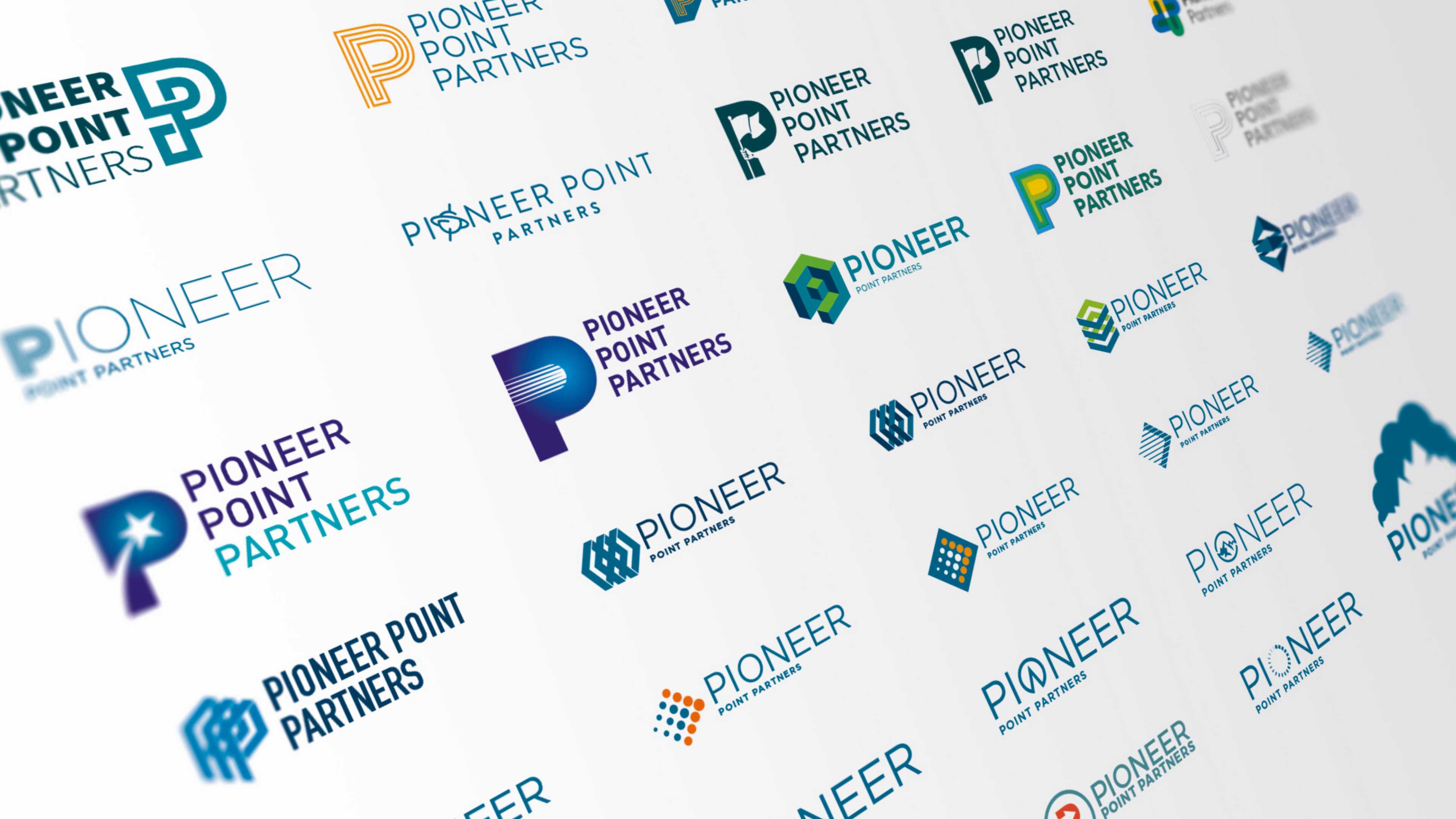
The project started as an explorative journey, shared by client and agency. We didn’t have to evolve the existing identity, so a clean slate meant exploring a wide variety of concepts and, through a process of presentation and feedback, together we iterated towards a successful outcome.


A robust identity
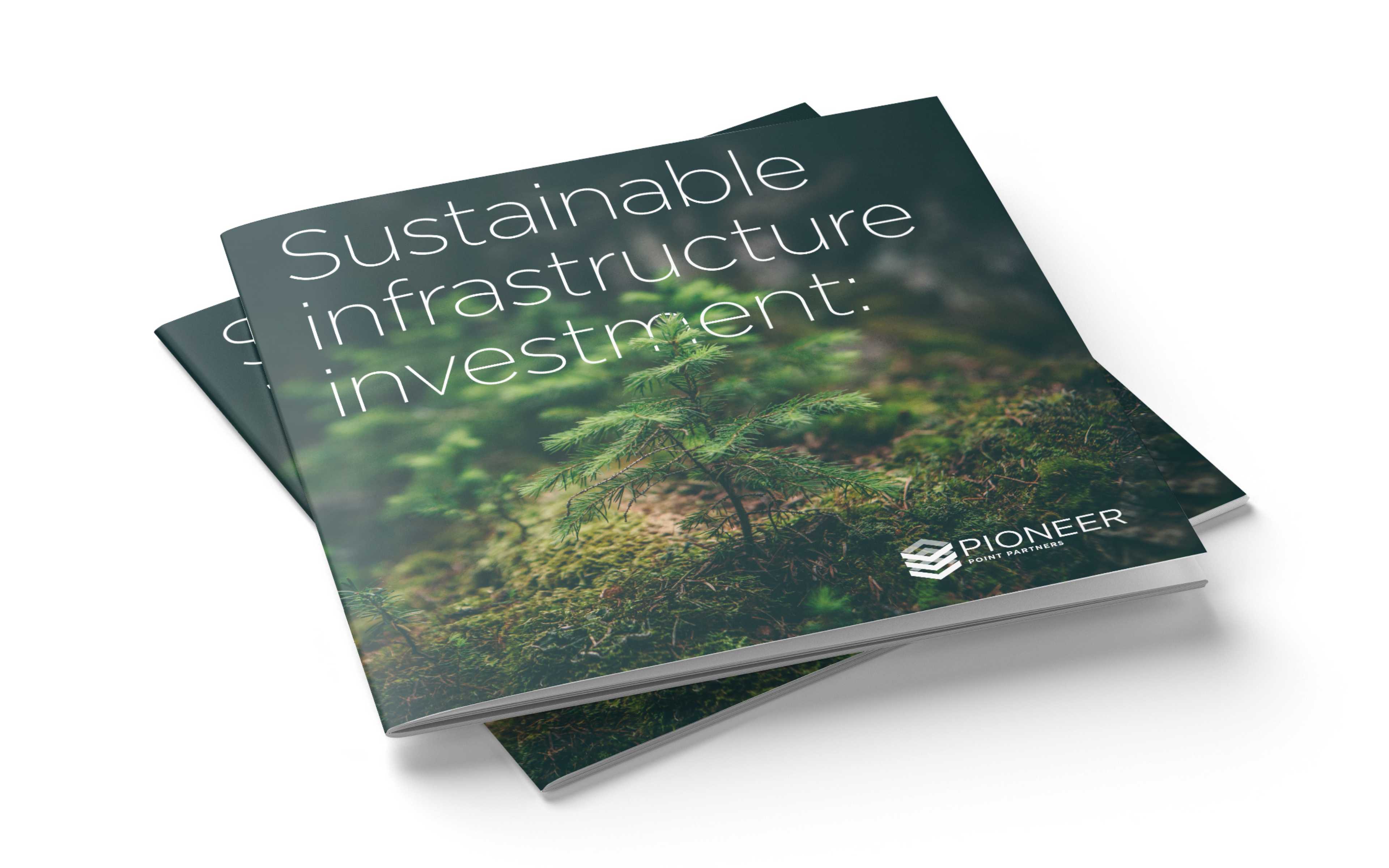
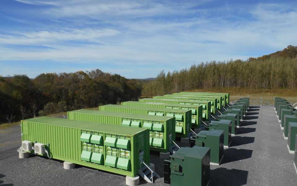
The approved concept takes inspiration from the idea of stored potential and the repeated rectilinear structures seen in industrial battery storage units. The angular forms of the symbol and precise sans serif typeface are entirely appropriate for an infrastructure investment firm, eschewing the leafy vernacular of the sustainability sector for something more robust and architectural.
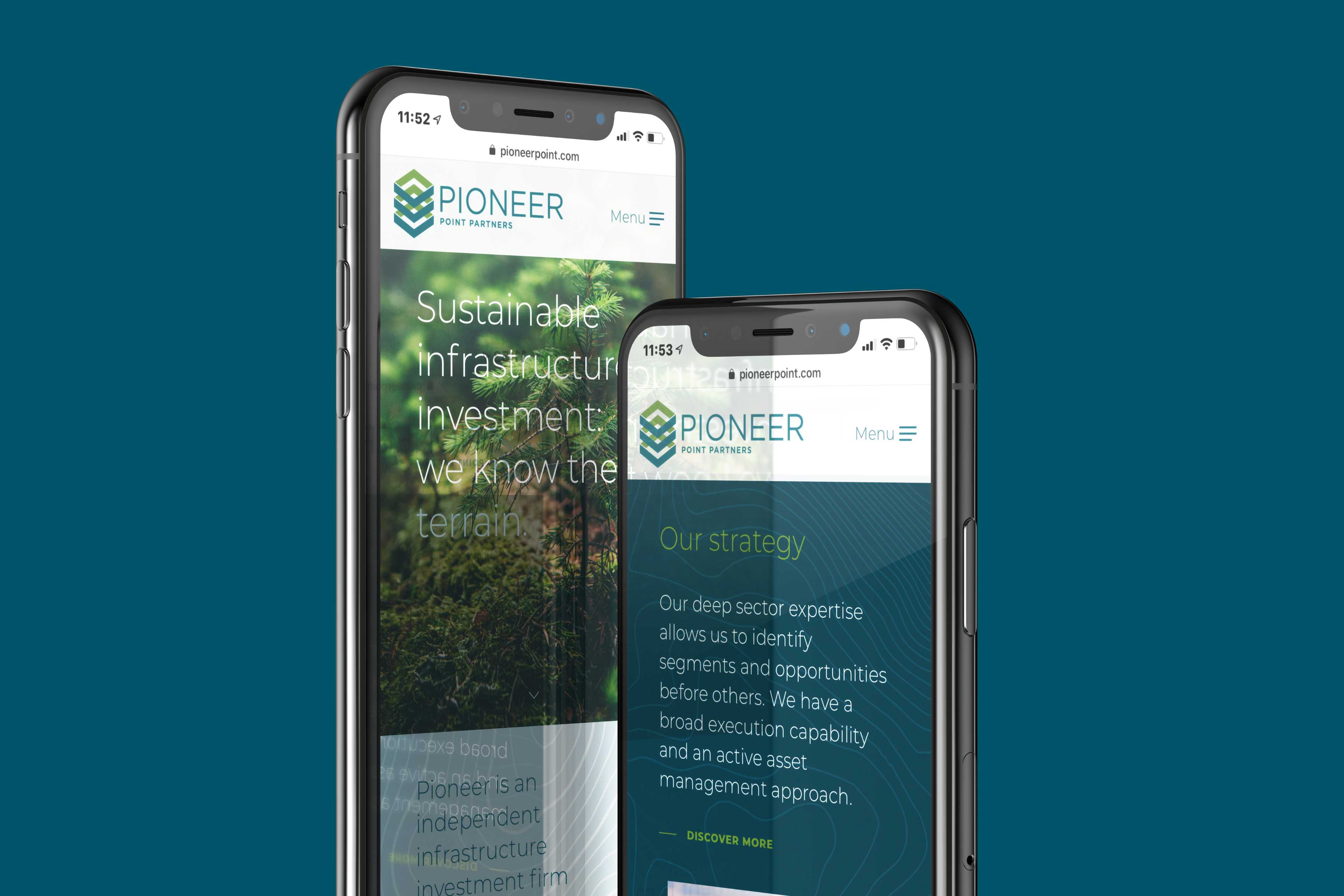
An explicit declaration
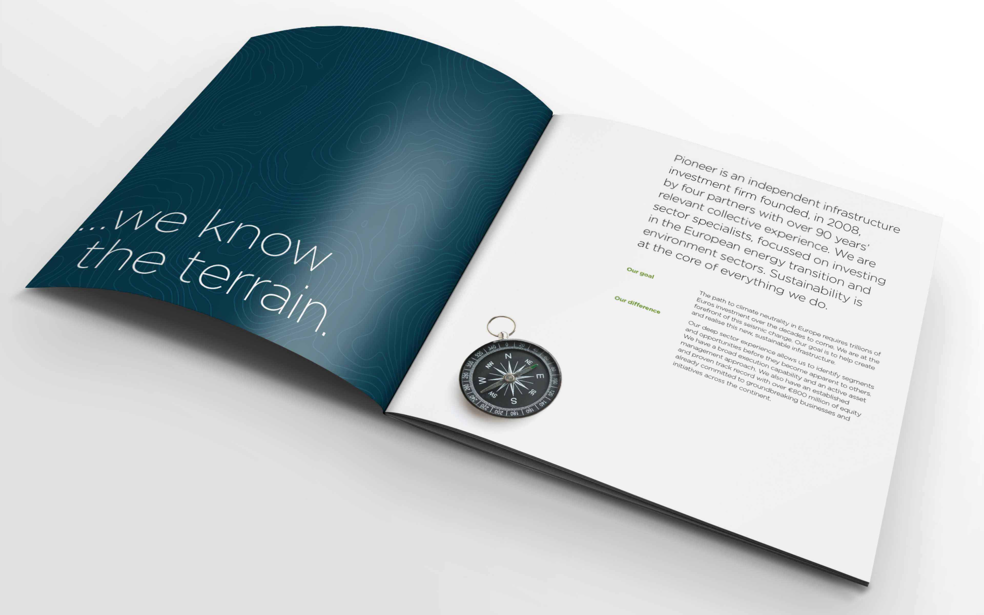
We developed a new tagline that brought the founders’ experience to the fore and amplified Pioneer’s positioning as a new energy infrastructure investment firm that knows the sector better than the competition. It draws together the complimentary ideas of pioneering activity and the environment into a concise statement of intent.
